The power of heritage.
In an effort to become more corporate, NAPA Auto Parts, the original auto parts store, was straying from its personality and become overcomplex.
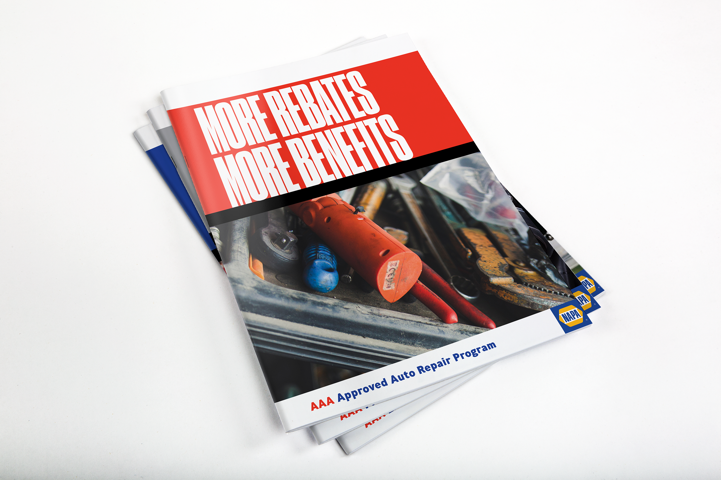
What started as an exercise to simplify the brand and messaging developed quickly into a strategically flexible, yet consistent audience-focused brand communication system.
It’s now the foundation of the system, anchoring the corner of every piece. Not only has the integrity of the NAPA brand been restored, but it also has new energy, it’s cleaner and more streamlined. We successfully created a system that reflects both the heritage and future of the brand.
Through time, more and more brands have needed to be attached to the NAPA logo-this can be complicated and create confusion. But our creative team has solved for this by simplifying graphic elements down to just the NAPA badge when this situation occurs.


